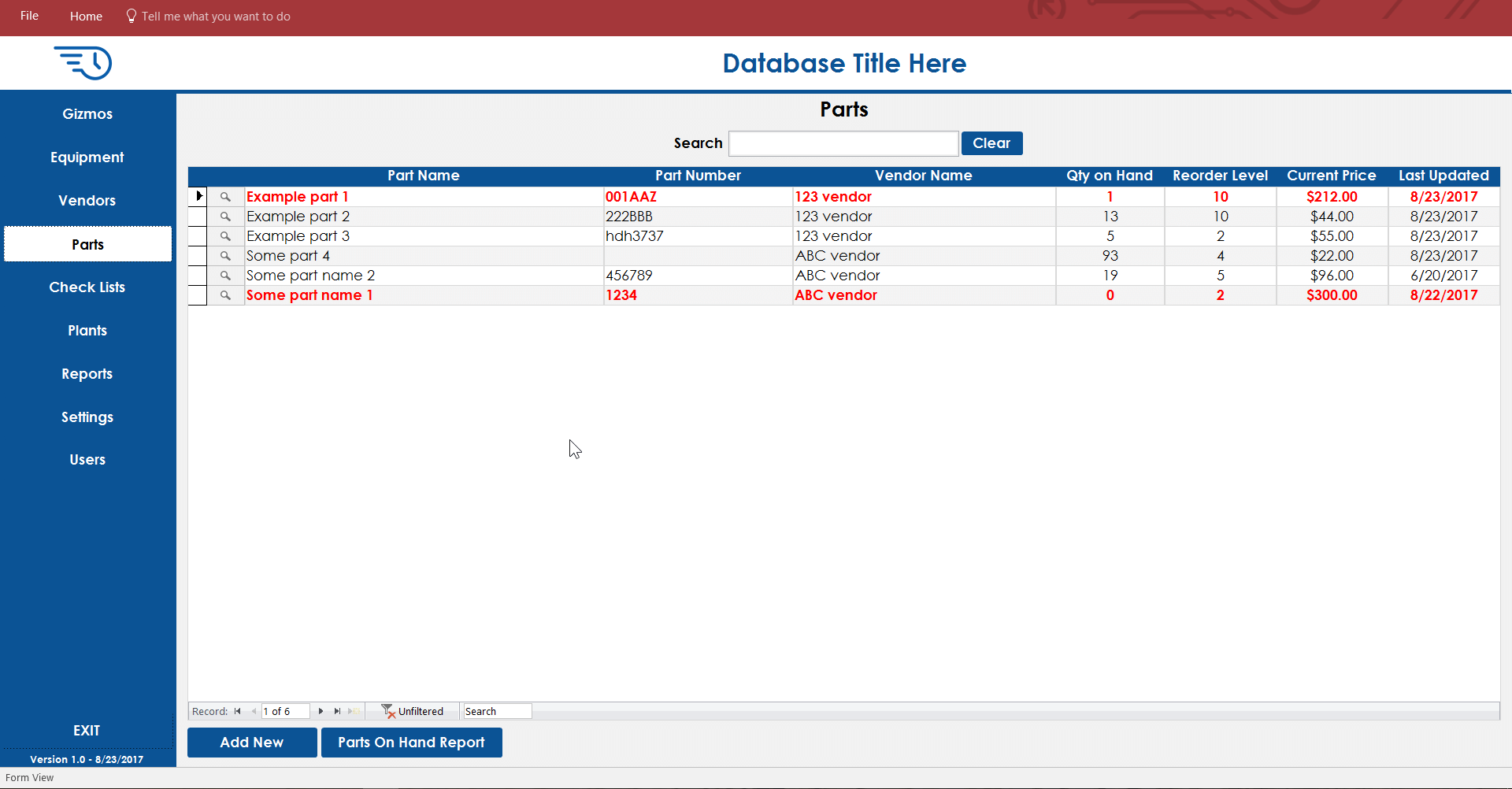
Introducing Better Dashboard Design
Better use of space
With the wide screens most of us use in today's offices it's better to utilize the space on the sides of the screen for tools as much as possible. We have come up with a very flexible design which can be used for all sorts of dashboards.
Easier to navigate
Placing the navigation on the side is better for most users to more easily get around the database.
Many Color Combinations
A huge range of color themes can be created by mixing the color themes which come built-in with Microsoft Access with variations of the header color, sidebar color and button colors.
Here are some examples:


